As an Amazon Associate, I earn from qualifying purchases.
A studio apartment can feel cramped even when it is clean, organized, and filled with furniture marketed for small spaces. That is because square footage is only part of the equation. The way you arrange that square footage affects where your eye travels, how easily you move, and whether one room feels calm or visually crowded.
The most common studio layout problems are not dramatic. A sofa that extends six inches too far into a walkway, a bookcase placed across the brightest window, or three tiny tables doing the job of one useful piece can quietly shrink the room every day.
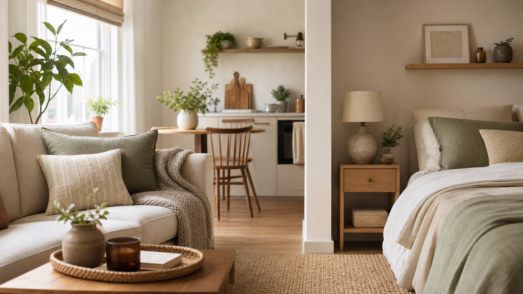
If you want inspiration for creating distinct zones, start with 10 Studio Apartment Ideas That Make One Room Feel Like Several. If your studio still feels cramped after trying the usual tips, use this guide as a layout diagnosis. You may be solving the wrong problem.
Before You Move Anything: Do the Doorway Test
Stand just inside your front door and look across the apartment. What stops your eye first? Is it the side of a wardrobe, the back of a sofa, the bed, or a pile of storage bins? Now walk from the entrance to the kitchen, bathroom, bed, and window. Notice where you turn sideways, step around furniture, or change direction for no functional reason.
Those interruptions are your first clues. A studio usually feels larger when the main sightline stays open, the brightest area remains visible, and everyday routes are easy to follow. You do not need a perfectly open floor plan. You need fewer visual and physical roadblocks.
Mistake 1: Pushing Every Piece of Furniture Against the Walls
It sounds logical: if every piece touches a wall, the center of the room should feel bigger. In practice, this often creates a ring of unrelated furniture around an empty middle. The apartment can feel less like a home and more like a waiting room.
Wall-hugging also makes it harder to create meaningful zones. The sofa may be too far from the coffee table, the desk becomes stranded in a corner, and the bed is visually connected to everything because nothing else has a clear boundary.
The fix: Pull one key piece forward just enough to give it a job. A sofa can float a few inches off the wall or turn perpendicular to it, creating a subtle edge between the living and sleeping areas. A narrow console table behind the sofa can reinforce the division while adding a landing surface. Before moving heavy furniture, mark the new footprint with painter's tape and live with the route for a day.
Mistake 2: Blocking the Longest Sightline
The longest uninterrupted view in a studio may run from the entry to a window, from the kitchen to the sleeping area, or diagonally across the room. When a tall or bulky object cuts through that line, the apartment seems to end at the obstacle.
Common offenders include a high-backed sofa facing the door, a wardrobe beside the entry, a solid bookcase used as a room divider, or a clothing rack positioned in front of a window. Even when the furniture technically fits, the room can feel boxed in.
The fix: Keep the first several feet inside the entrance visually light, and place taller pieces along walls that do not interrupt the room's deepest view. If you need a divider, choose something light-permeable: an open bookcase, slatted screen, or curtain that can be pulled aside. The goal is not to expose the entire apartment. It is to preserve a sense of depth.
Mistake 3: Choosing Furniture by Width but Ignoring Depth
A sofa can be advertised as apartment-size and still overwhelm a studio. Width gets most of the attention, but depth is often what steals the walkway. Deep lounge seating, oversized rolled arms, thick recliner backs, and bulky platform beds can consume valuable inches without adding useful function.
The same problem shows up with dressers and media consoles. A piece may fit along the wall while projecting so far into the room that the route beside it becomes uncomfortable.
The fix: Measure the full footprint, not just the wall length. Tape it on the floor, then test the surrounding path. A shallow media console with a depth of roughly 15.7 inches is a useful benchmark for how little a piece can project into the room while still holding a TV and storage — note that this style typically ships with anti-tip hardware meant to secure it to the wall, so factor that into your placement. Aim for roughly 30 inches of clear passage on routes you use constantly when your floor plan allows it. If the piece forces you to turn sideways or clips the natural path to a door, drawer, or closet, it is too deep for that location.
Mistake 4: Filling the Studio With Too Many Small Pieces
Tiny furniture does not automatically make a tiny apartment feel larger. A collection of small side tables, stools, carts, bins, and narrow shelves creates more edges for the eye to process. The result can feel busy even when every individual item is compact.
This is especially common when a studio is furnished gradually. One temporary piece solves a problem, then another is added beside it, and eventually six small items occupy more space than two well-chosen pieces would.
The fix: Consolidate jobs. Replace a coffee table, extra stool, and loose blanket basket with one storage ottoman bench — a folding style gives you hidden storage and extra seating, and it can fold flat when you are not using it. Choose one taller storage piece instead of several low units scattered around the room. Fewer, more capable pieces create longer visual lines and make the layout easier to understand.
Mistake 5: Creating Zones That Interrupt the Flow
Zones are useful in a studio, but more division is not always better. A rug, divider, shelf, or furniture arrangement can define a living area while accidentally creating a maze between the entrance, bathroom, kitchen, and bed.
A zone has failed when you have to walk through the middle of it to reach something unrelated. For example, if the path to the bathroom cuts between the sofa and television, the living area will never feel settled. If a desk chair blocks the closet whenever it is pulled out, the work zone is stealing space from the storage zone.
The fix: Draw your everyday routes first, then place zones around them. Keep the busiest path as direct as possible and avoid making it cross the conversation area between a sofa and chair. An appropriately sized area rug can define a zone without becoming a tripping edge; ideally, at least the front legs of the main living-room seating should sit on it so the arrangement reads as one group rather than several floating objects.
Mistake 6: Letting the Bed Dominate the First View
There is nothing wrong with having a real bed in a studio. The problem is placement. When the mattress is the first and largest object visible from the entrance, the entire apartment can read as a bedroom, which makes the living area feel secondary and compressed.
Trying to hide the bed with a large solid divider can make the problem worse by replacing one visual block with another.
The fix: If the floor plan allows, place the bed outside the direct doorway sightline or turn it so the narrow end faces the room. Use the bed's position to create a quieter sleeping edge rather than dropping it into the center of the apartment. If privacy matters, a freestanding folding room divider can soften the view while still allowing light and air to travel — since it stands on its own, no wall installation is required.
Mistake 7: Using Storage to Solve a Layout Problem
When a studio feels crowded, buying more organizers can seem like the obvious answer. But storage products add physical volume. If the real issue is blocked circulation or too much furniture, another cart, cabinet, or set of bins can make the apartment feel even tighter.
Storage helps only when it gives existing belongings a clear home without competing with the room's main pathways. A row of visible bins along a wall may contain clutter while still creating visual clutter.
The fix: Edit before you add. Then look for unused vertical space, the area under the bed, the back of a door, or the inside of a closet. Prioritize storage that disappears into an existing footprint instead of claiming new floor space.
For renter-safe ways to use those existing footprints, see 21 Genius No-Drill Storage Solutions Every Renter Needs.
Mistake 8: Ignoring Doors, Drawers, and Furniture in Motion
A floor plan can look perfect while everything is closed and still fail in daily life. Closet doors swing out. Dining chairs slide back. Desk chairs roll. Sofa beds open. Storage ottoman lids lift. Drawers need space in front of them.
When those movements overlap, the studio feels frustrating and crowded because using one thing requires moving another. A chair that must be relocated every night before opening a sofa bed is not a minor inconvenience; it is evidence that the layout is asking the same square feet to do two jobs at the same time.
The fix: Test the apartment in motion. Open every door and drawer, pull out each chair, unfold convertible furniture, and walk the main routes while everything is in use. Keep the pieces you use every day free of conflict. It is fine if an occasional guest setup requires rearranging; daily functions should not.
A 20-Minute Studio Layout Reset
You do not need to redesign the entire apartment at once. Start by removing one nonessential small piece from the room. Open the longest sightline you can identify. Clear the main route from the entrance to the bathroom and kitchen. Then shift one major piece so the living and sleeping areas have clearer edges.
Stop before buying anything. Live with the new arrangement for two or three days and notice what improves: the first view, the walk to the closet, the amount of light, or the ease of using the sofa. Once the layout works, you can see whether you truly need a divider, rug, storage ottoman, open shelf, or smaller piece of furniture.
The Goal Is Not an Empty Studio
A studio should still feel warm, personal, and comfortable. Making it feel larger does not mean stripping it down until it looks temporary. It means giving your eye a place to travel, your body a clear route to move, and every zone enough definition to do its job.
The best layout is not the one that looks most impressive in a photo. It is the one that lets you enter, cook, work, relax, sleep, and get dressed without constantly negotiating with your furniture. Fix the biggest interruption first. The rest of the apartment will usually feel easier from there.
Need inspiration after the diagnosis? See 10 Studio Apartment Ideas That Make One Room Feel Like Several